
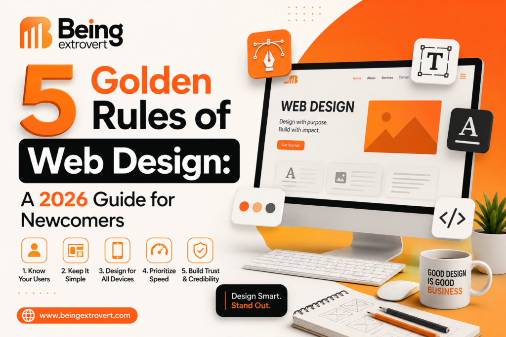
5 Golden Rules of Web Design: A 2026 Guide for Newcomers
The digital world of 2026 is a noisy place. For those just starting out, diving into the realm of pixels, grids, and hex codes can be as bewildering as trying to fix a jet engine while it’s airborne.
But here is the secret most “gurus” won’t tell you: great design isn’t actually about flashy animations or complex scripts. It’s about communication. Whether you are building your very first portfolio or a small business landing page, these 5 golden rules of web design serve as the anchor. They prevent your project from drifting into the “amateur” zone and ensure your visitors actually stay on the page. Let’s dive into the mechanics of what makes a website truly work in today’s high-speed economy.
1. Master Visual Hierarchy (The Art of Silent Guidance)
If everything on your page is screaming for attention, your user hears nothing but static. Visual hierarchy is essentially the practice of arranging elements to imply importance. In 2026, with attention spans hovering at record lows, you have roughly two seconds—if you’re lucky—to tell a visitor where to look first.
Think of your webpage as a map. Without a “You Are Here” marker, the user gets lost and bounces. Following web design rules regarding hierarchy means using scale, color, and placement to create a literal path for the eye.
The Power of Scale
The most critical element—usually your Value Proposition or Hero Heading—needs to be the largest. This isn’t just about “being big”; it’s about contrast. If every heading on your page is 40px, nothing stands out. You need that 80px “hero” to dominate the space.
Color as a Beacon
Use bold, high-contrast colors for your Call to Action (CTA) buttons. A “Get Started” button in a vibrant shade against a neutral background is a classic example of professional web design principles in action. It’s a visual “click here” sign that doesn’t need words.
Scanning Patterns
Most users don’t actually “read” websites; they scan them. They usually follow an “F” pattern on text-heavy pages or a “Z” pattern on landing pages. Place your most critical web design principles along these natural eye paths to ensure the message hits home.
2. Mobile-First is No Longer a “Feature”—It’s the Law
We used to talk about “responsive design” as if it were a luxury add-on. In 2026, it is the absolute foundation. More than 75% of global web traffic now originates from mobile devices. These basic web design rules dictate that you should design for the smallest screen first and scale up to the desktop later.
When you start with a mobile-first mindset, you are forced to prioritize. You can’t fit twenty menu items on a smartphone screen, so you have to choose the five that actually matter. Following web design best practices for mobile means:
- Touch Targets: Ensure buttons are “thumb-friendly.” Aim for at least 44×44 pixels so users don’t accidentally click the wrong link and get frustrated.
- Legibility: Text must be readable without the user needing to pinch and zoom. A 16px font size is generally the “floor” for mobile body text nowadays.
- Adaptive Content: If your site looks stunning on a 27-inch monitor but breaks on an iPhone, it’s an incomplete design. 2026 users expect a seamless transition; they don’t care about your technical hurdles.
3. Embrace Whitespace: The “Breathing Room” Your Content Needs
A common mistake beginners make is fearing empty space. There is often a psychological urge to fill every corner with icons, banners, or text. However, seasoned professionals view whitespace (or negative space) as one of the most important rules of web design.
Whitespace isn’t just “empty”; it’s a structural tool. It performs three critical functions:
- Reduces Cognitive Load: By giving elements room to breathe, you prevent the user’s brain from feeling overwhelmed.
- Groups Related Elements: Using proximity, whitespace tells the user which image belongs to which paragraph without needing a border.
- Highlights Content: The more space you put around an object, the more important it looks.
Think of a luxury brand’s website. Usually, it’s mostly white space with one high-quality image. This conveys elegance, focus, and value. Without whitespace, your website design rules for beginners will result in a site that feels cluttered, cheap, and stressful to navigate.
4. Consistency: Building Trust Through Uniformity
A common beginner trap is using five different fonts and seven shades of blue just to show off “creativity.” In reality, this destroys user trust. Professional web design principles suggest sticking to a strict “Style Guide” to maintain a cohesive identity.
Consistency should be applied to:
- Typography: Use a maximum of two font families. One for high-impact headings and one for highly legible body text.
- Buttons and UI: If your “Submit” button is rounded on the home page, it shouldn’t be sharp and square on the contact page.
- Color Palette: Use a primary color, a secondary color, and one accent color for CTAs.
When you follow these web design guidelines for beginners, you create a professional “brand feel.” Consistency tells the user that you are detail-oriented. If the design is erratic, the user may subconsciously worry that your product or service is erratic too. It’s a psychological game of reliability.
5. Accessibility and Performance: Designing for Everyone
In 2026, a “pretty” site that doesn’t work for everyone is a failure. Essential web design principles now heavily weigh accessibility (WCAG standards). This is no longer just a legal requirement; it’s a functional one.
- Color Contrast: Ensure there is enough contrast between your text and background. Light gray text on a white background is a design sin that makes your site unusable for many.
- Alt Text: Always provide descriptive Alt Text for images. This allows screen readers to describe the visual to blind users and—bonus—massively helps your SEO.
- Performance is a Design Choice: Speed is a design choice. If your site takes 10 seconds to load because you used massive, unoptimized 4K images, users will leave.
Use web design tips for beginners like:
- Compressing all images using tools like TinyPNG.
- Using modern formats like WebP or AVIF.
- Minimizing heavy JavaScript “bloat” that slows down the “First Contentful Paint.”
Comparison: Beginner vs. Professional Logic
| Feature | Beginner Mistake (Avoid) | Professional Logic (Follow) |
| Layout | Cramming content into every corner | Strategic use of whitespace |
| Fonts | Multiple decorative fonts | 1-2 clean, legible font families |
| Navigation | Hidden or complex menus | Simple, intuitive navigation paths |
| Images | Raw, heavy file sizes | Compressed, fast-loading visuals |
| Mobile | Desktop-only with “shrunk” text | Fluid, mobile-first responsive layout |
Conclusion: The Human Element
Mastering the 5 golden rules of web design isn’t about achieving “perfection” on your first try. It’s about a commitment to the user’s experience. The digital world is evolving toward AI-driven interactions, but the core human psychology of how we perceive beauty and utility remains the same.
Stick to these web design rules, keep your layouts clean, and always ask yourself: “Does this element help the user reach their goal?” If the answer is no, delete it. The most successful designs in 2026 are the ones that feel invisible because they work so perfectly.